LumiPoster
Bold visibility. Anywhere.

Brand guidelinesVersion 1.0, October 2026
Everything needed to present LuminaTech correctly: the idea behind the brand, how the logo is built and used, the spectrum, the type and the imagery, and the files to do it.
Content reviewed by Felipe Leite, Director of Creative Marketing & Special Projects. Questions about any AHC World brand: marketing@weareahc.com
Introduction, essence and creative concept
We don't sell square footage of LED. We build visual stories that move audiences and make brands unforgettable.
LuminaTech Media Solutions designs, delivers, installs and runs LED screens and media for events, venues and brands: from a single poster display to a full stage backdrop, with one crew accountable from setup to strike.
Every pixel has a purpose.
Nothing on a LuminaTech screen is decoration. Every point of light is placed to carry a message, and the brand behaves the same way: precise, luminous and never louder than the story it serves.
The name is set on an LED grid. Every letter is made of individual pixels, and the spectrum crosses the word from blue to amber the way light travels across a panel. When the logo moves, it lights up pixel by pixel.
Logo, versions and brand architecture
Three parts. Point at a part to see it.
Use the primary logo whenever the descriptor can be read. Below that, use the wordmark. On screens, the logo can light up.
Primary
Wordmark and descriptor. The default.

Wordmark
Small sizes, favicons, merchandise, where the descriptor would blur.
Motion logo
For screens and video: the pixels light from left to right, then the descriptor.
LuminaTech is a sister brand within AHC World, with its own identity. It doesn't carry the Atlanta Home Concierge endorsement.


Grid, clear space and minimum size
The logo is drawn on a square grid of LEDs: every pixel sits on a crossing, one pitch apart. The unit x is the height of the descriptor; proportions are measured from the artwork.
Keep at least 2x clear on every side, shown by the dashed frame. Light needs dark around it to read.
The descriptor needs room to stay readable; the wordmark goes smaller. Shown at actual screen size.
Primary: 260 px on screen, 2 in (51 mm) in print
Wordmark: 96 px on screen, 0.75 in (19 mm) in print
Color versions and backgrounds
Full color on black
The first choice. Light reads best on dark.
Full color on white
Documents, print and light layouts.

White
Over photos, video and LED content.

Black
One-color print, engraving and stamps.
Pick a background to see which version to use.
Most LuminaTech images are full of light and color, by day and by night. Three rules keep the logo readable on them.
The spectrum, layout colors and specifications
The spectrum lives in the logo and in light effects. Layouts around it stay black and white, so the color always reads as light.
| Color | HEX | RGB | CMYK | Role |
|---|
CMYK values are starting points converted from RGB; confirm them with a printed proof.
Mostly dark, white for words, the spectrum only where light belongs.
LuminaTech isn't always black. Night mode is for screens, stages and dark venues; day mode is for documents, proposals, the web and anything printed. The spectrum stays inside the logo and the 2-pixel line in both.
Lights on.
Black ground, white text. Screens, stages, social.Lights on.
White ground, black text. Documents, web, print.Typefaces, hierarchy and composition
JD LED5 is the dot-matrix face of the logo: names, numbers and short headlines, as if shown on a screen. Sora, a clean geometric sans, carries everything people read for longer.
ABCDEFGHIJKLMNOPQRSTUVWXYZ
abcdefghijklmnopqrstuvwxyz
0123456789
Restrictions and examples
The logo only works when it is reproduced exactly as supplied. These are the most common mistakes.
The LED grid, the spectrum and pixel icons
A field of unlit pixels is the brand's background texture. It works behind headlines, on stage screens and in print, as long as it stays quiet: dark grey dots on black.
The logo's gradient as a 2-pixel rule: under a headline, as a progress bar, along the edge of a screen. Never as a background fill.
Icons are drawn on the same LED grid as the logo, eleven pixels square. Use them in white on dark, black on light, or lit in a single spectrum color for state (on, live, selected).
Products, installations and image treatment
Light in context, by day and by night.
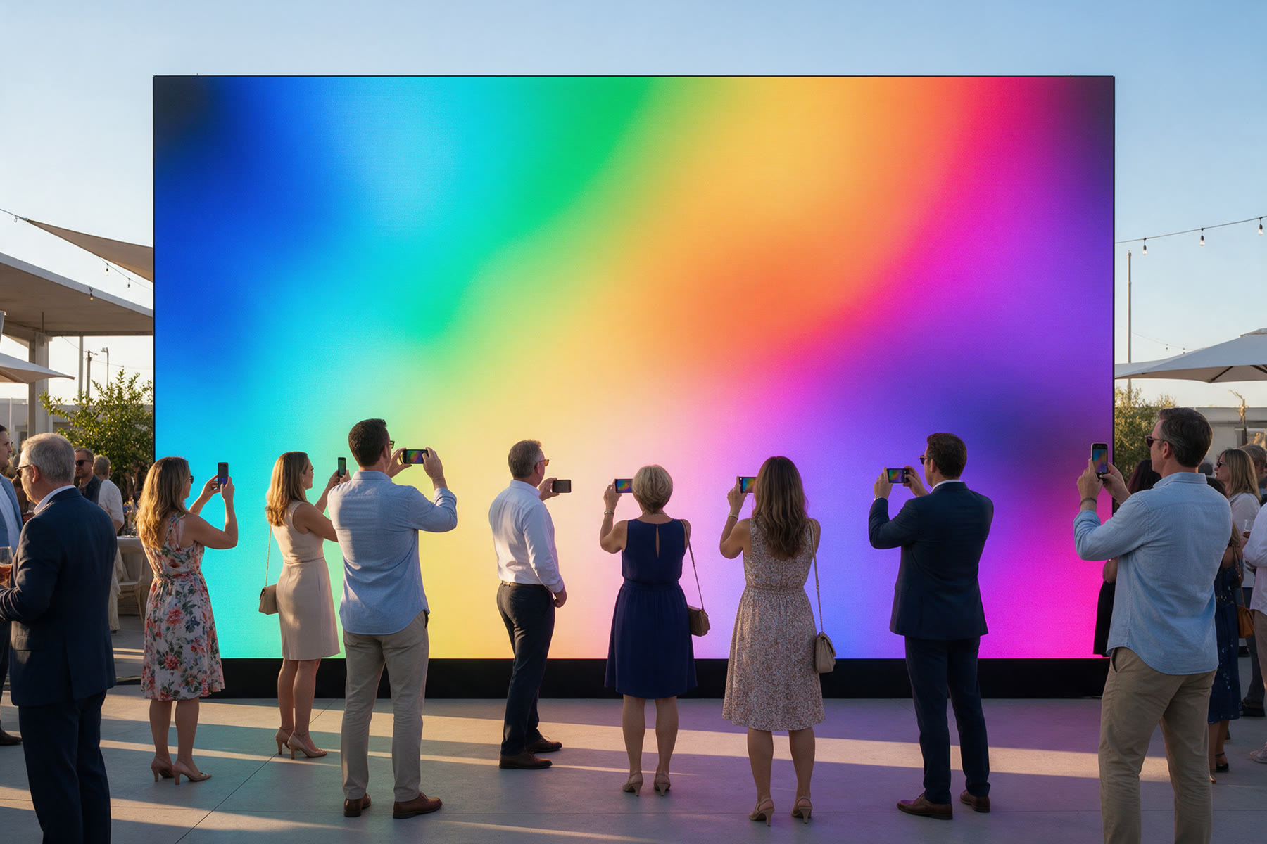
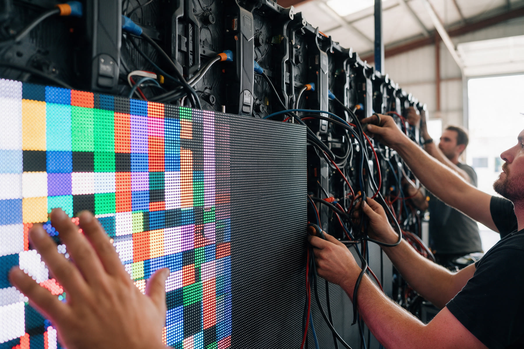
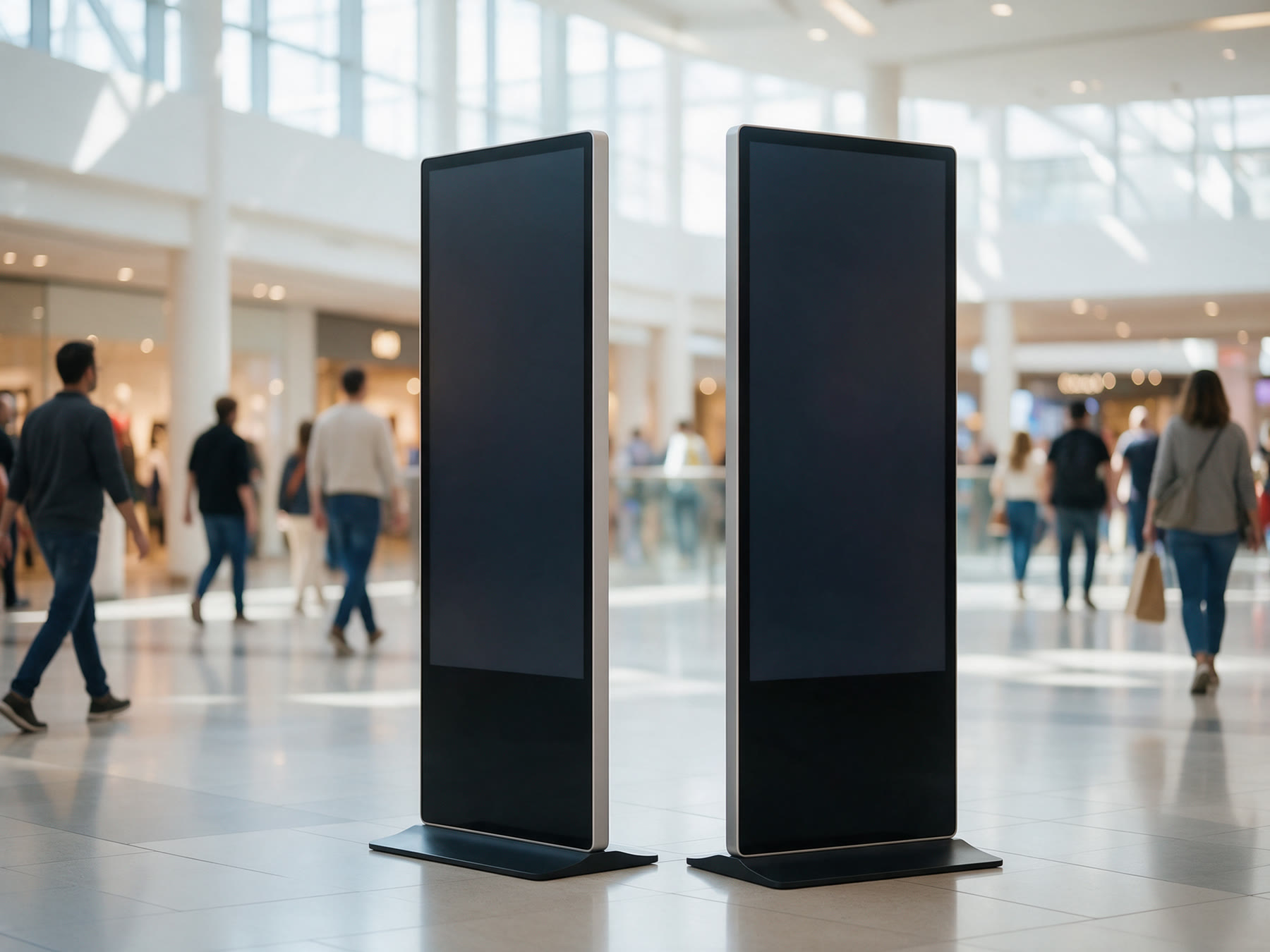
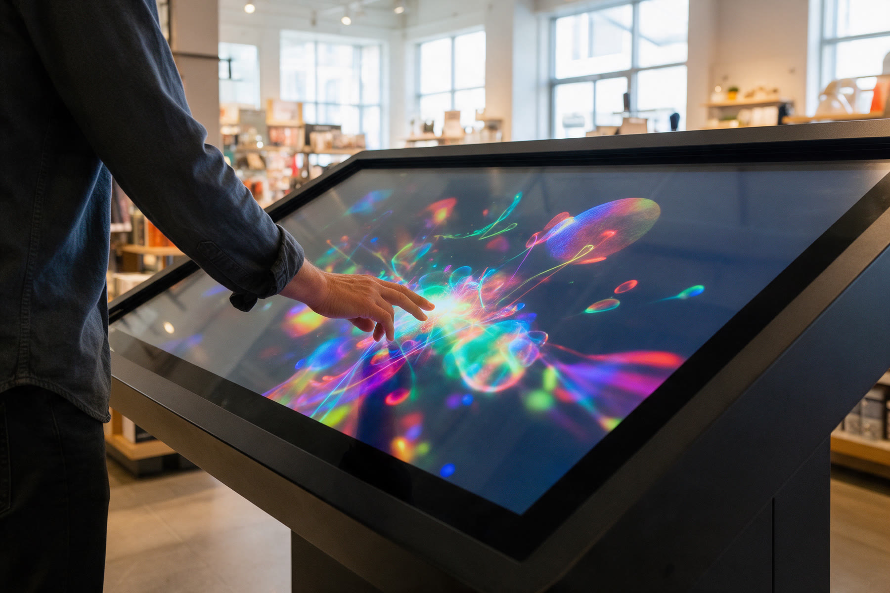
LuminaTech photography shows screens doing their job where people are: bright lobbies and plazas in daylight, stages and venues at night. The screen is always on and in color, people react to it, and the hardware looks clean and well installed.
Bright, open spaces with natural light. The screen holds its own against the sun, and the scene feels busy and real.
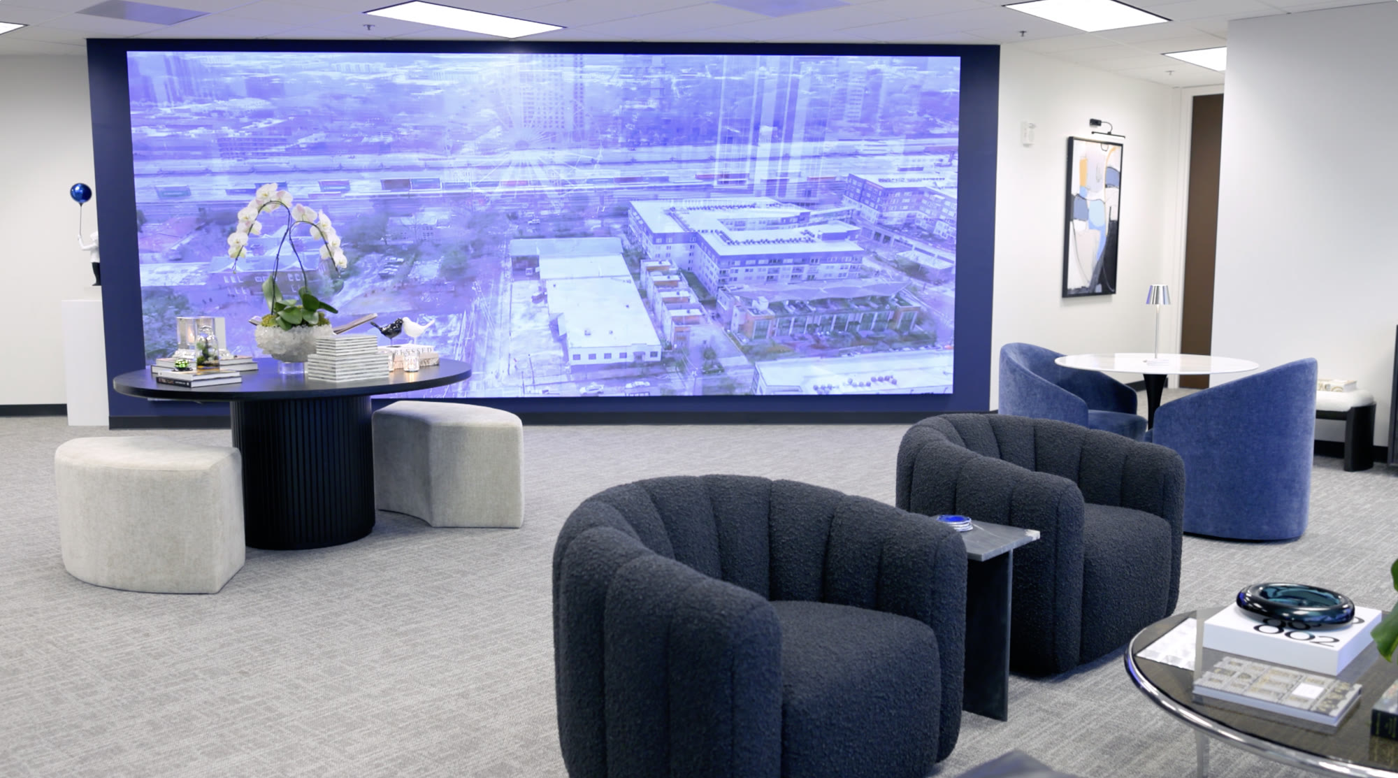
Dark rooms where the screen is the brightest thing in the frame. Expose for the screen, keep the room readable.

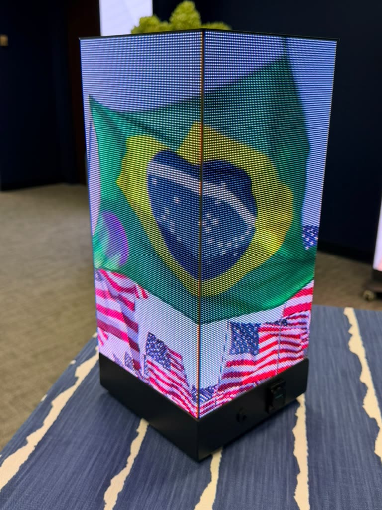
Daylight references are AI-generated style references; replace them with photos from LuminaTech jobs as they come in.
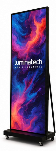
Product photography: on white, screen on, full height, shot straight on or at a slight angle.
Bold visibility. Anywhere.
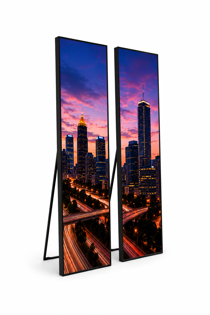
Stand tall. Stand out.
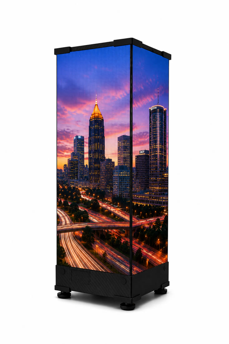
Think outside the screen.
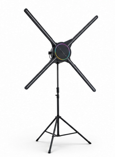
Bring dimension to your message.
Stationery, screens and advertising
The identity on screens, gear and print, by day and by night. Official artwork and real content mapped in perspective onto each photo.
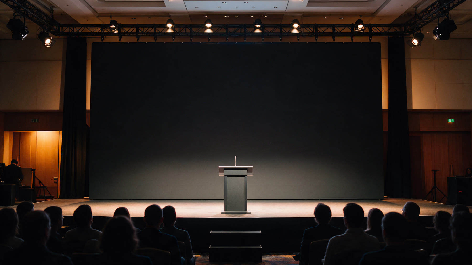
Every pixel has a purpose.
Lights on.
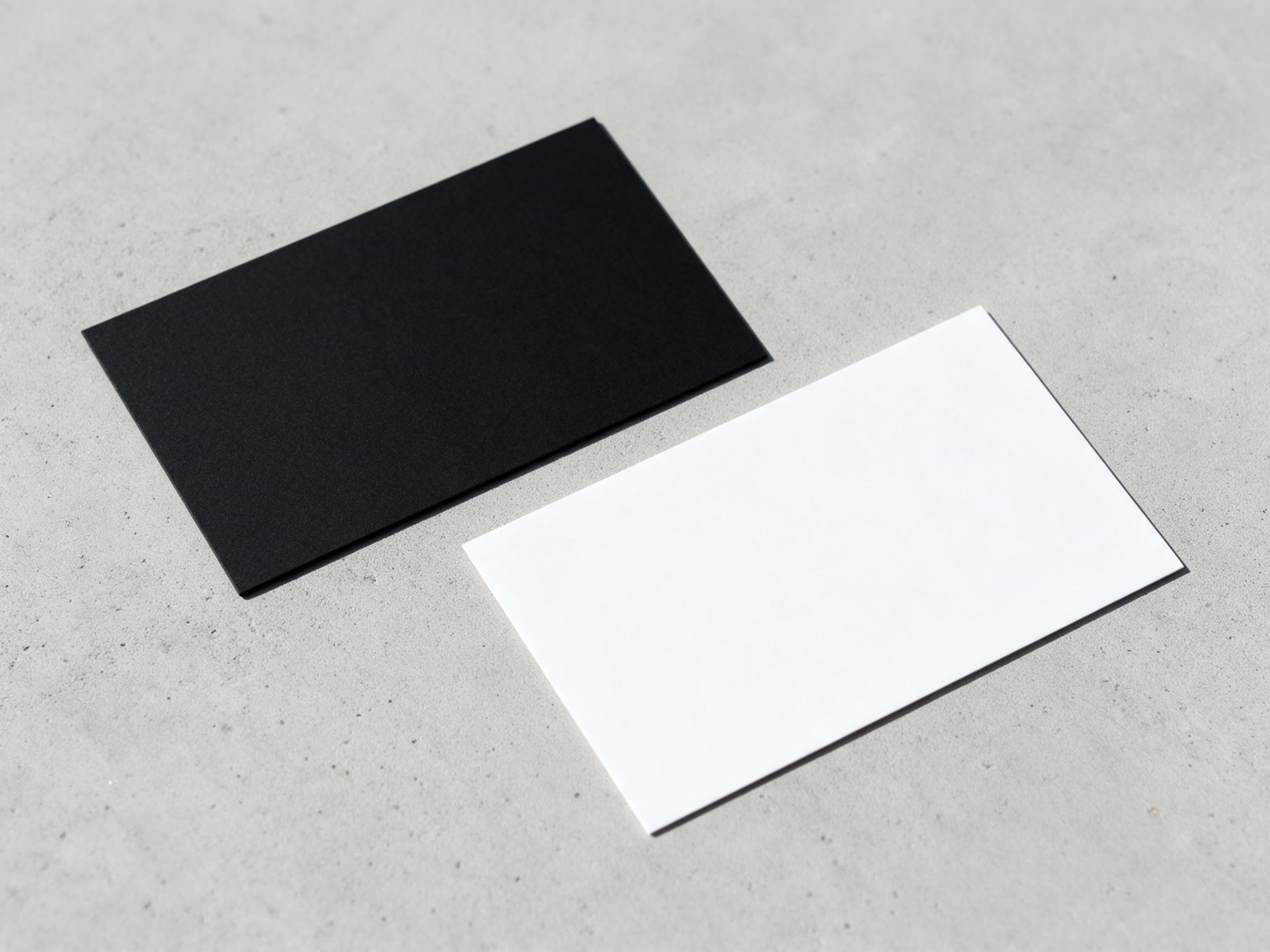
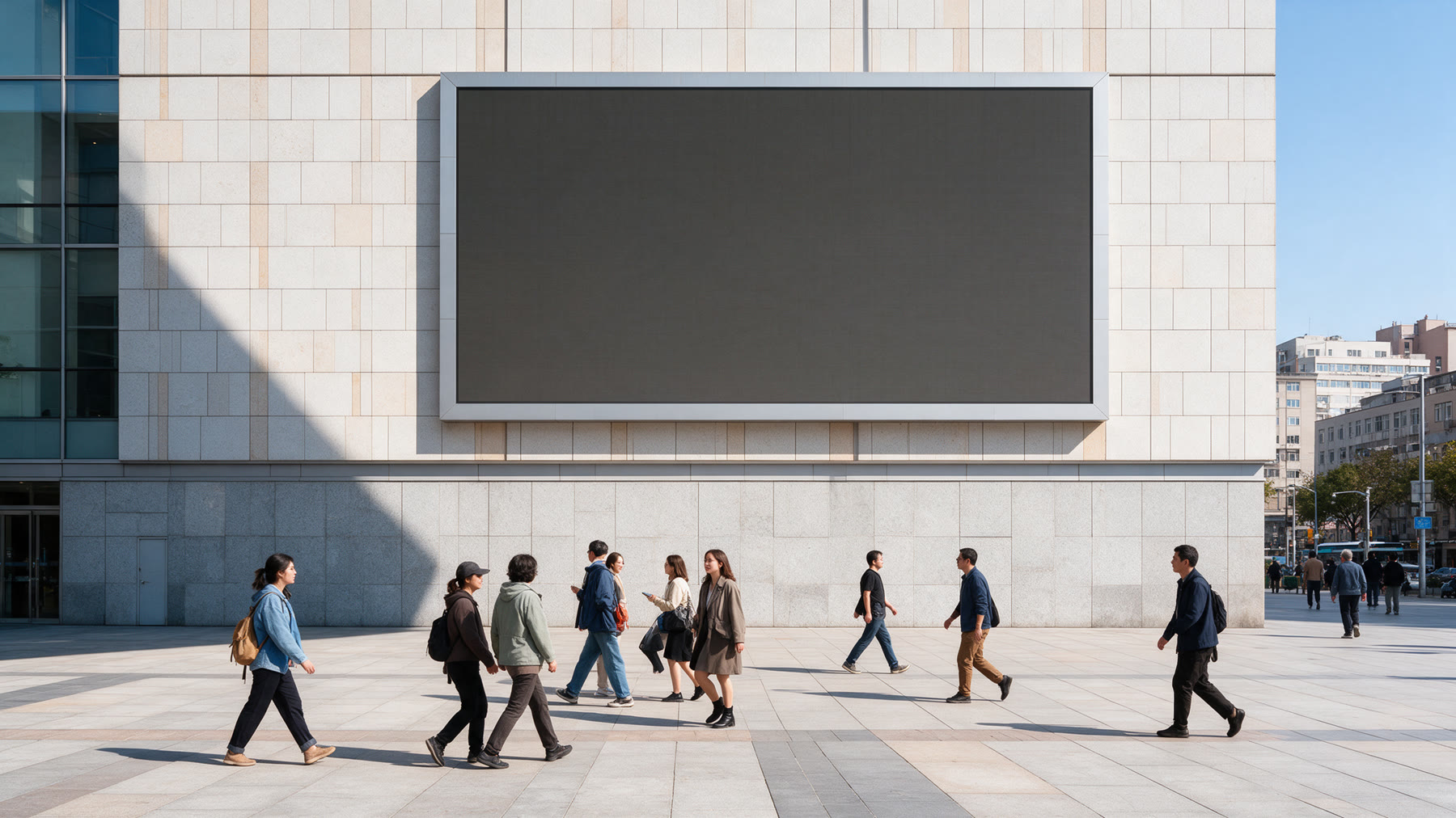
Indoor. Outdoor. Custom.
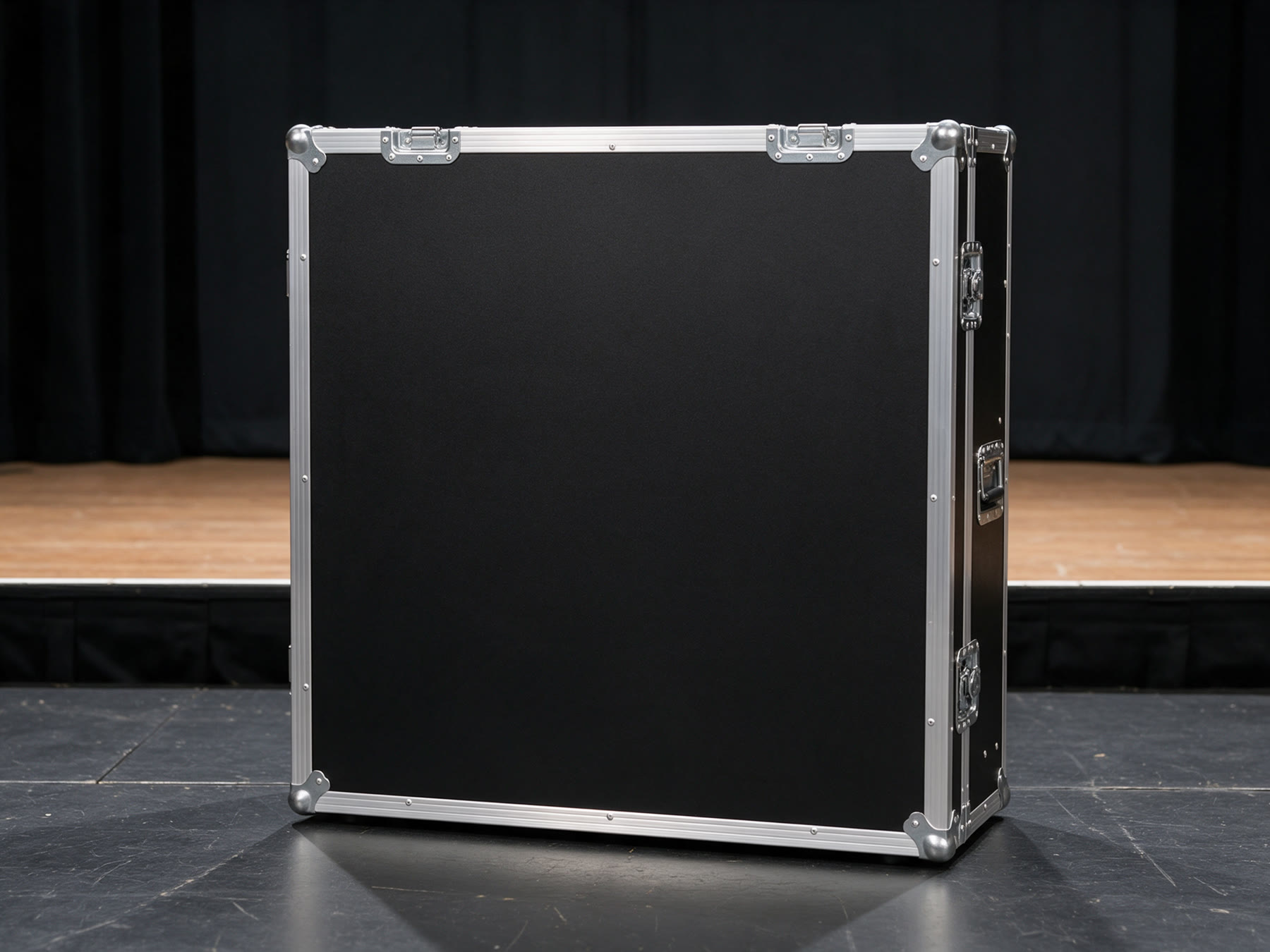
Case 07. LED panels.
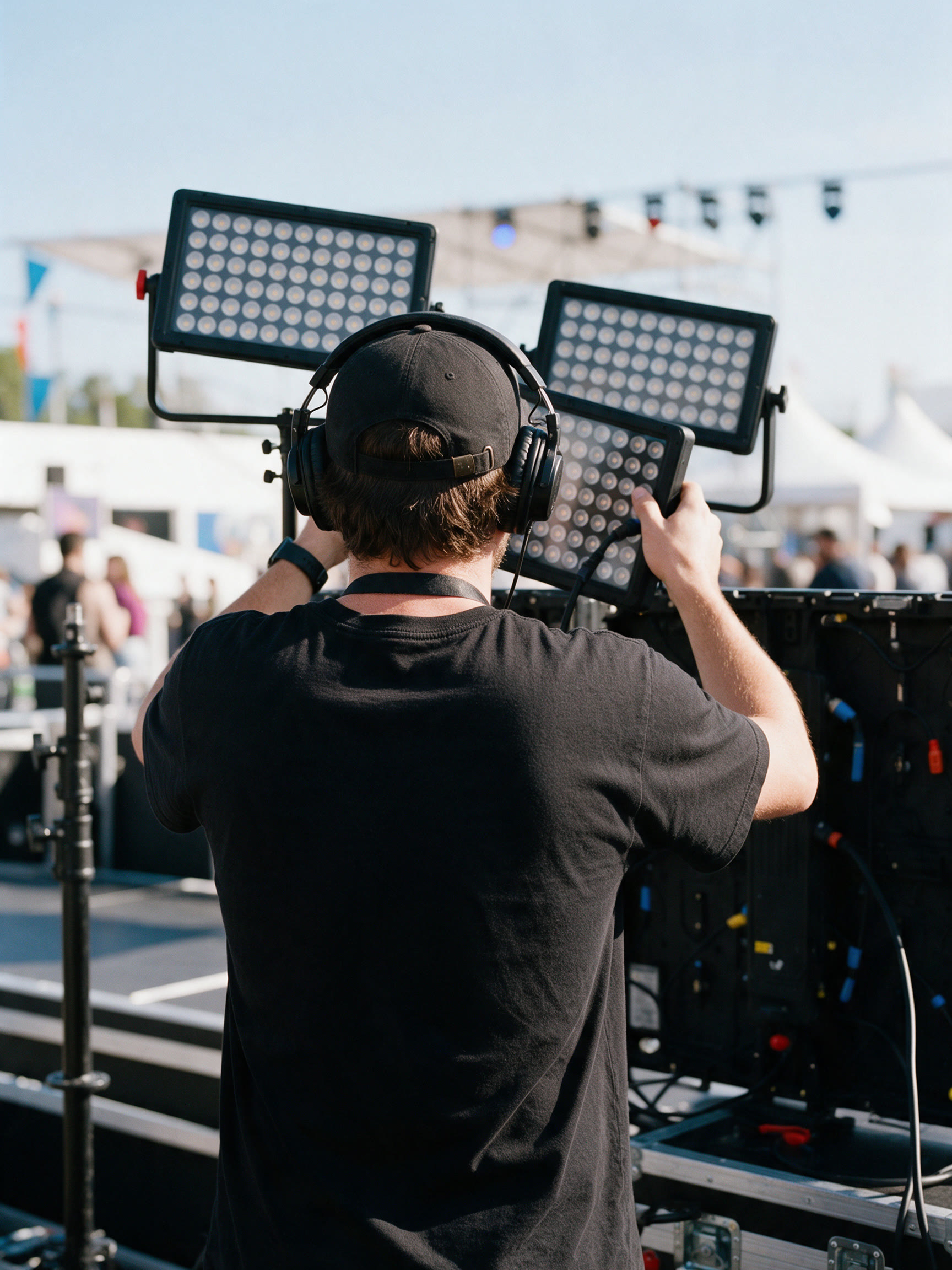
crew
Mockup photographs are illustrative and AI-generated; the logo, content and type are the official artwork.
Formats, organization and usage
Websites, apps and LED content software. Vector, sharp at every size.
Print and sign makers. Vector; send this one to printers.
Slides, documents and quick use. Transparent background, 3000 px wide.