




Brand guidelinesVersion 1.0, October 2026
Everything needed to present Atlanta Home Concierge correctly: the ideas behind the brand, how the logo is built and used, the colors, type and imagery, and the files to do it.
Content reviewed by Felipe Leite, Director of Creative Marketing & Special Projects. Questions about any AHC World brand: marketing@weareahc.com
Introduction, essence and creative concept
Since 2005, Atlanta Home Concierge has cared for the homes, offices and lifestyles of Atlanta.
Residential, corporate and lifestyle services under one name: housekeeping, house management, private chefs, drivers, pet care and more, delivered by people who know the city.
Evolving with Atlanta.
Atlanta changes every year, and so do the lives of the people we serve. Atlanta Home Concierge grows with them while keeping the same standard of care in every home, office and routine.
The logo draws Atlanta's skyline without lifting the pen. One line holds the whole city, the way one company holds every service, and every corner is rounded so the line flows.
Atlanta, drawn in one line.
Rounded at every corner.
Never lifted, never broken.
Logo, versions and brand architecture
Three parts that always travel together. Point at a part to see it.
Use the primary logo whenever there is room. The stacked version and the symbol exist for spaces where it doesn't fit.
Primary
The default. Websites, documents, signage, advertising.
Stacked
Square and vertical spaces: social avatars, uniforms, bags. No descriptor.

Symbol
The skyline alone, for patterns and details once the name has been seen.
Atlanta Home Concierge is the parent brand of AHC World. House of AHC carries its endorsement in the logo; LuminaTech stands on its own identity.


Grid, clear space and minimum size
The unit x is the height of the wordmark capitals. Every proportion below is measured from the official artwork.
Keep at least x of empty space on every side, shown by the dashed frame. Nothing enters it: no text, edges, photos or other logos.
Below these sizes the descriptor stops being readable. Shown here at actual screen size.
Primary: 200 px on screen, 1.5 in (38 mm) in print
Stacked: 72 px on screen, 0.6 in (15 mm) in print
Color versions and backgrounds
Full color
White and light backgrounds. The first choice.
Reversed
Navy Concierge and dark backgrounds; the skyline stays Green Skyline.
One color, Navy Concierge
Single-ink print, engraving, embossing.

One color, white
Green Skyline or colored grounds, embroidery on dark fabric.
One color, black
Only when Navy Concierge isn't available, such as newspapers.
Pick a background to see which version to use.
Primary colors, shades and specifications
Two brand colors and white. Navy Concierge carries the voice, Green Skyline draws the line, and white gives everything room. Click any value to copy it.
The voice of the brand: the name, every line of text, solid backgrounds.
The skyline, lines and highlights. On white, text stays Navy Concierge.
The ground the brand lives on, and the text color on Navy Concierge.
| Color | HEX | RGB | CMYK | Use |
|---|---|---|---|---|
| Navy Concierge | 34 43 74 | 54 42 0 71 | Primary. Text, wordmark, solid grounds | |
| Green Skyline | 82 167 88 | 51 0 47 35 | Primary. Skyline, lines, highlights | |
| White | 255 255 255 | 0 0 0 0 | Primary. Backgrounds, text on navy |
CMYK values are starting points converted from RGB; confirm them with a printed proof.
Not new colors: lighter and darker steps of the two brand colors, for the jobs the primaries can't do on their own.
Mostly white, with Navy Concierge for weight and Green Skyline as the accent.
Typeface, hierarchy and composition
The typeface of the logo, in two weights. Bold for names and headlines, Regular for everything else.
ABCDEFGHIJKLMNOPQRSTUVWXYZ
abcdefghijklmnopqrstuvwxyz
0123456789 &@$%
Restrictions and examples
The logo only works when it is reproduced exactly as supplied. These are the most common mistakes.
The line, pattern and iconography
The skyline's single stroke can leave the logo and lead the eye across a layout: as a divider, an underline or a path that rises into the city at a key moment. Always Green Skyline, at the logo's stroke weight, with rounded joins.
Since 2005, across Atlanta.
The symbol repeated in offset rows makes a quiet texture for packaging, the back of business cards and large walls. Use it in one color, at low contrast.
The full set used on atlantahomeconcierge.com: single-weight line icons with rounded ends, like the skyline. Use them in Navy Concierge or Green Skyline, never filled, at one size within a group.
Visual style and image treatment
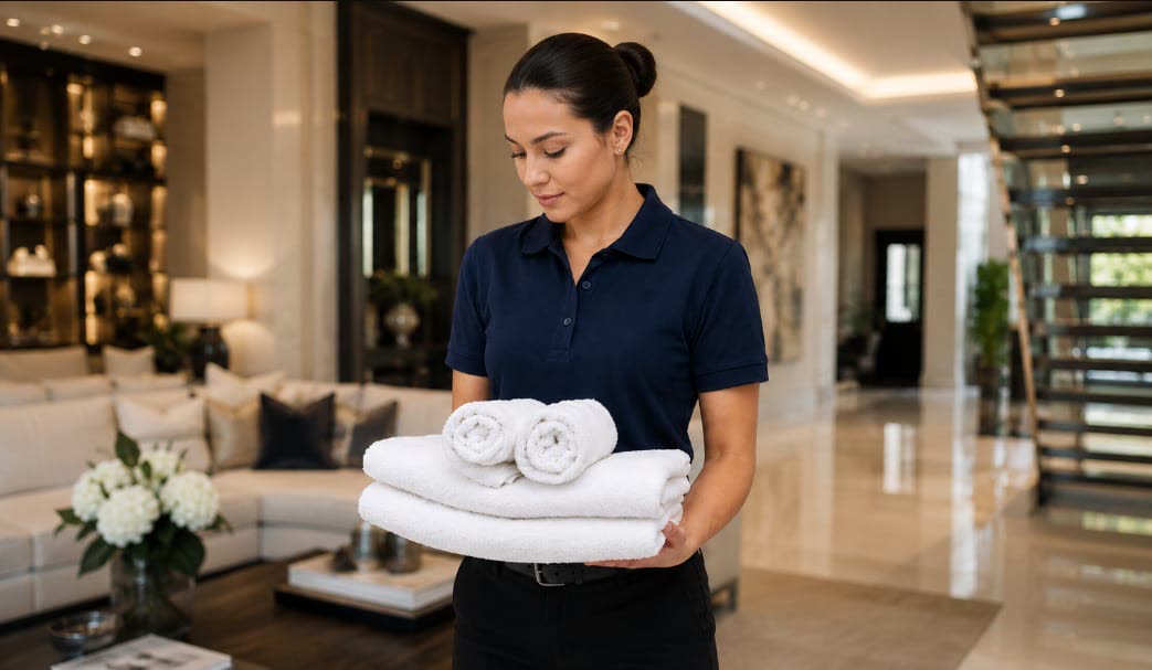
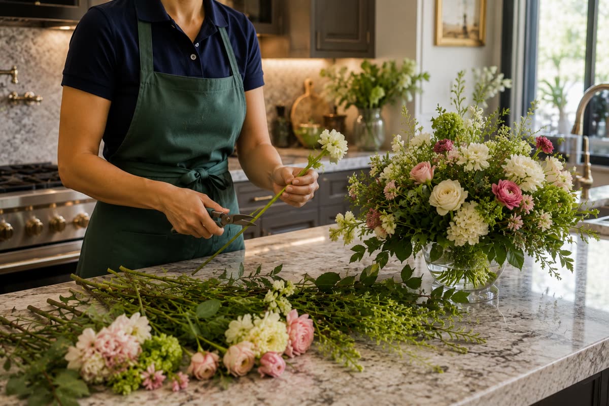
Real people doing careful work in calm, well-kept spaces.
Photography shows the service, not the staging: hands at work, rooms in order, the moment a task is done well. Light is natural, color is true and the frame is close enough to feel the detail.
Stationery, uniforms, vehicles and digital
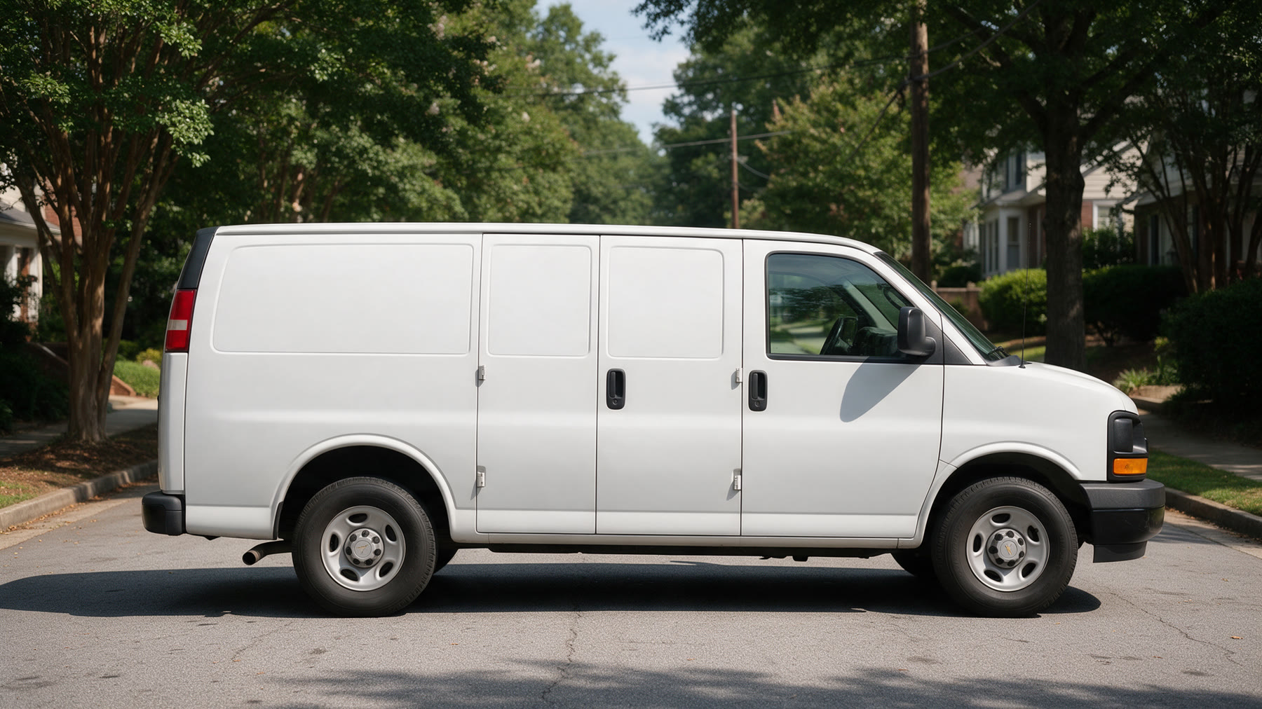
The identity on the objects people actually see. Each mockup uses the official artwork, the palette and Utendo, applied in perspective onto the photo.
Since 2005, caring for the homes, offices and lifestyles of Atlanta.
Request a service
Mockup photographs are illustrative and AI-generated; the logo and type are the official artwork.
Formats, organization and usage
Websites, apps and any screen. Vector, sharp at every size.
Print and sign makers. Vector; send this one to printers.
Office documents, slides and quick use. Transparent background, 3000 px wide.